Tyler Alpern, Art Instructor | ||
 | ||
| ||||||
 | ||
 | ||||
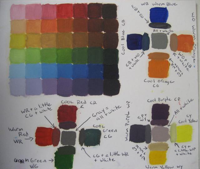
Tips: Keep the colors as saturated as you can, either add white to lighten it or its coplement to darken it. DO NOT add white and a complement at the same time. That will cause the color to dull or gray istelf. Paint opaquely, don't let the white of the background shine thru, the white shining thru will lighten the color you mixed. RED: mix both reds and place it in the center of the red row for acrylic or one spot to the right of center for oils. Darken with a dark green that you mix, a light green will only dull the red. Slowly add small amounts of green or you will darken the color too much, too fast. ORANGE: Lighter than red when fully saturated, pure orange will be to the left of center in its row. Remember that saturation and value WILL NOT MATCH. Darken with blue, if the blues turn the orange greenish, you don't have enough red in your mix to complement the blue you are using so add a little red to the mix too. YELLOW: so light, pure color may not be on some students' charts. Almost no one will need to add white. Darken with purple and if it turns green, your purple needs more red. This may the hardest color to work with. GREEN: Mix a very dark grean with mostly blue. Ti may fall in your last or next to last square. Darken with red if need be. BLUE: Blues likely come out of the tube dark enough to be in your last square. They are dark when pure. PURPLE: Also very dark, may be pure in the far right square too. Remember to use a cool red to create purple. | ||||
HINTS: Mix small amounts of paint! To lighten a large amount paint add color to white not white to a pile of color. WORK QUICKLY, This is a lot to accomplish. I want you to get the idea, and then move on. If I wanted this to be perfect I would give you more than a day to do it. Let's get the hang of this then start a real painting. | ||
 | ||
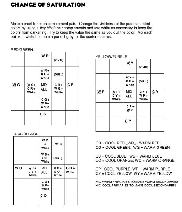 | ||||
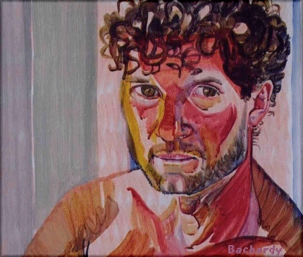
Instructions: Change saturation of color from vivid to dull by adding a color's complement PLUS white. Do not darken the color, only dull it! The white corrects the darkening effect of adding the complement. The dull red should still look like red, the dull green should still look like green, etc. Make sure you only use small amounts of complements and white to dull the orignal color. If the color you mix nolonger resembles the original color, then try again with smaller amounts of the addtional colors. Tips: "Cool Purple" has more blue than red, "Warm Purple" has more red than blue. Don't use your Warm Red to create any purple as it will not give you a saturated purple to start with. Warm and Cool Greens could be made a variety of different ways: same yellow, different blues would be a quick way to mix them. Use Warm Red and Warm Yellow to make Warm Orange and the cools to create the Cool Orange. Add white to your pure blues and purples to as they are naturally so dark. Yellow is a light color, make sure that the dull yellows you mix are light enough, use heaps of white. Neutrals and grays are created by mixing complementary colors (red/green, blue/orange, violet/yellow). Your paints may not be true complements so bits of other colors may be needed to achieve a neutral gray. As you get close to gray, use only tiny amounts of new colors to make adjustments, the new colors will have a powerful effect. If you only seem to get brown, add blue. If your gray looks purple, add yellow, if it looks green add red, etc.. | ||||
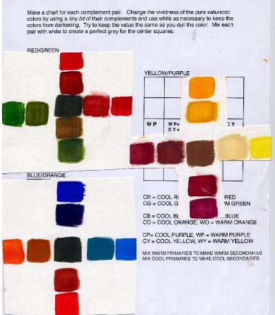 | ||||
Left: Finished charts overlap the instruction page. Note that the dull yellows are still light and that the dulled colors tend to stay the same value as the pure saturated colors with the exception of thetop warm blue which is too dark in the dulled version. The dulled version needs more white to lighten it. The center gray in the purple/yellow chart is very brown because it needs more blue. The purples used are both very red. | ||||
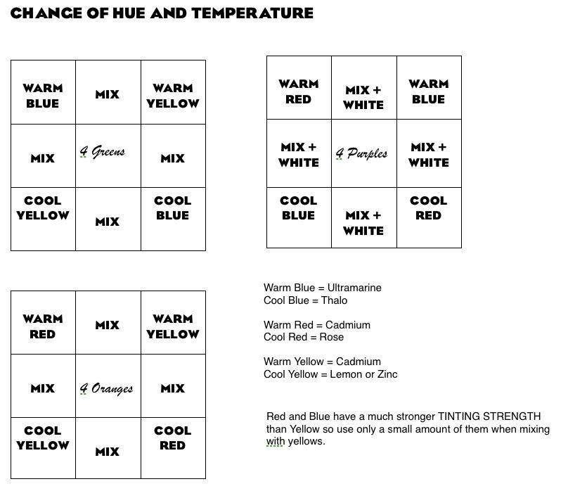
Value Study \Complement Mixing: Create a 30 color abstract collage with magazine clippings. Recreated it in black and white with paint.. Mix complements to create grays. Match values of grays exactly with the values of the colors on your original. Compare color to a sample of gray and squint to see if you have a match. If the border between the 2 is hard to discern, a match has been found.You may use or create a gray scale to aid in matching or to check your work.
Shading and Color Strategies: | ||
 | ||||
 | ||||
 | ||||||
 | ||||||
 | ||||||
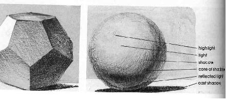
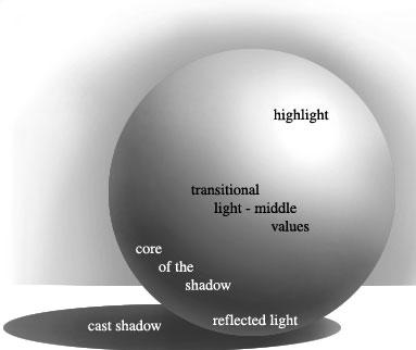
Shading Tips: Formula Shading is a set of conventions in which artists use tone to create the illusion of three dimensional space on a flat surface. You should apply these conventions even when drawing from life to make your drawing have a sense of volume. When the form or subject has a bend or a corner, the tone should change in value drastically to communicate that physical change. As a plane on a form (like a table top) recedes back in space, its tone should shift to show depth. A subtle shift in tone either towards dark or light communicates depth. When a highlight or core shadow is on an outside edge, the form is flattened. Use reflected light and let the highlight darken as it approaches an edge to make a form seem round. The darkest part of the light is still lighter than the lightest part of the shade. The reflected light is still darker than the darkest part of the light. Outlines flatten form. Form shadows tend to have soft edges, cast shadows tend to have sharp edges. Shadows are transparent and lighten as they become more distant from their source. Color: true local color is in the light. Highlights are lighter and may use a bit of complement for emphasis. Shadows and shade are cooler and grey. Highlights follow the viewer, shadows are fixed based on the light source.
Use a full range of value from white to black to maximize the illusion of volume and mass. | ||
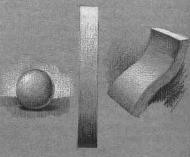
Purpose: In this exercise you will learn how to create the illusion of mass and volume thru shading and how to lighten or darken a color using mixing or transparency or context. You will also learn how to make color more dynamic and complex to add visual interest and keep the viewer’s attention. In each of the exercises below, use the rules of formula shading and a full range of value from dark to light in order to maximize the illusion of volume. To keep your objects looking 3-D, minimize brush stokes and outlines. Paint forms at about 3 inches.
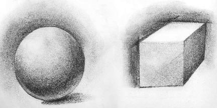
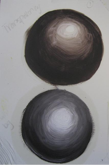
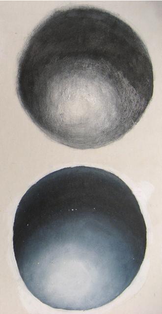
1. Opacity vs Transparency. Use complementary colors to create a neutral gray. Then paint 2 spheres. For one you can use white paint to lighten the gray. For the second, use the white background for your light. Either use tiny amounts of paint and dry brush or thin the paint to a wash or glaze. (Pigments in water-soluble oils will separate in a thin water wash - that is okay.) Keep value transitions soft, and both spheres should look if they were painted only with black and white even though you started with vivid color. Spheres below are transparent on top and opaque with white paint below. | ||
 | ||||
 | ||||
2. Optical Mixing.
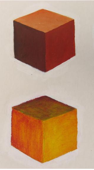
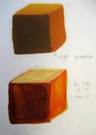
Use color layering to create luminous color. Paint 2 cubes, each will be the same secondary color, one will be opaque and the other will transparently layered.
For instance, orange: mix yellow and red paint to create orange, use purple and white to darken or lighten as needed and paint 1 cube. These are called physical mixes.
Then layer color for the second cube. In the second cube paint the whole thing yellow first, already define the planes with saturation and value; let dry. Then paint a thin layers of reds over the yellows so that the yellow shines thru and creates orange. This orange will have a very different look than the orange you created by physically mixing the paint. These are optical mixes. You can also create an optical mix by placing tiny dots of colors of the same value next to each other and viewing from a distance. Your eye will blend the colors to create one new color. Optical mixing can produce very different effects than physical mixing. Lightening a red by letting white shine thru has a very different look than lightening with white which creates pink. | ||
 | ||||
 | ||||
3. Non-local Color and Value Matching.
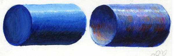
Paint 2 blue cylinders. In one, only use shades of blue and make it solid. In the second, make it appear hollow and add as many different colors as you can and still have it appear to be a blue cylinder. By exactly matching values of the additional colors to the the areas of blue that they appear, the viewer will accept the color as part of the form rather than a spot on the form and the form will have stronger visual interest. | ||
 | ||
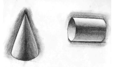
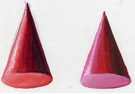
4. Termperature Shifts with Value.
Paint 2 red cones in one, shift from warm to cool as you go from light to dark, in the second shift from cool to warm as you move from light into dark. | ||
 | ||
Simultaneous Contrast: Color is changed by its context. Colors are influenced in hue by adjacent or surrounding colors, each tinting its neighbor with its own complement. Thus color will take on the character of the complement that adjoins it. For example red will give a greenish and cooler cast to the color it surrounds and blue will give a warmer and orangish cast to the color it surrounds. The afterimage also influences color with the color’s own complement. The relative value of a color also changes. A medium value color surrounded by a color light in value will seem darker than the same color surrounded by a dark. With pure and vibrant colors, changes will be slight. Secondary colors change in context more than primary colors. Grayed and neutral colors are constantly changing in different color context.
Color Layering & Beyond Local Color: Color Layering: You will be layering paint and using transparent color. The goal for this assignment is to see layers of color. A blue sky for instance might be painted orange first and then when dry painted blue allowing some of the orange to show through. Or a light blue might be painted over a dark blue. Try many different color combinations. In fact the whole canvas or paper should be covered in the first hour. Oil painters should be thinning their paint to a watery consistency for the first layer. There are many different techniques for letting underlayers show through: 1. Use thin, transparent paint (you will find adding white to color will make that color less transparent) 2. Let the undercolor be seen in the space between brushstrokes. 3. Paint wet on wet so the undercolor mixes in a bit. 4. Scrape or wipe through the paint to revel the layer below. 5. Drybrush or rub onto the dry undercolor a new layer. Be experimental and find a variety of ways to to this.
Beyond Local Color: If you commit to the actual value of the local color, you can use any other color and not confuse the viewer. Keeping the value liberates the artist from using local color. Use local color in the light and then use expressive color in the shade or vice versa.
Instructions for Layering / Beyond Local Color Painting: 1. Have a really terrific idea that you are excited about. You will work long and hard on this painting and the finished work can survive long past your grandchildren so put some effort into developing a visual concept that you won’t soon tire of. Make sure that you have both a thoughtful subject and a background. The background should create an environment and context for your subject. You cannot copy a photograph, even if it is your own. But you can use photos for references and inspiration. Having both a subject AND a theme can help your concept be compelling. Your subject is the actual objects you are depicting and the theme is what you are expressing as an artist thru the objects or how you paint theme. The theme is your artistic comment and it can be about form, emotions, values, etc. Your subject is what you are painting and your theme is why you are painting it. For example a portrait should depict not only how the person looks, but reveal something about who they are or what you want to say about them. 2. Make at least 10 compositional thumbnail sketches to try to find the best or most dynamic way to present your idea. Think about scale and how the shapes interact with the edge of the canvas. Contain your sketches in a box that is the approximate shape and proportion of your canvas so that you can see how the sketch relates to its placement on the canvas. 3. Cover the whole surface of the painting with a loose, colorful and bold under painting within the first session. Paint with thin paint that dries fast and does not add physical texture that can interfere with the painting later on. Color choices can be random and far off from the final intended colors. These first colors will add the complexity of the colors that are layered on top and help provide visual texture.
What you need to achieve: 1. A painting that is not too small. Somewhere around 18 x 24 or larger is ideal. 2. Your painting must reveal layering in about 80 percent of the finished surface by using any of a variety of techniques including: transparency, glazing and optical mixes; dry brush, negative space between brush strokes, subtractive techniques such as wiping or scratching, etc. 3. Your painting must go significantly beyond the use of local color. That means if you are painting a bunch of bananas, how many colors can you add to the bananas besides yellow and still have the viewer know that you are painting yellow bananas? There are heaps of ways to achieve this. For example use value matching to add colors in either the light or shade or both. Remember that we understand a black and white photograph only by value clues so as long as you are true to or exacting of the value, the color you use can be quite expressive and surprising.
To get full credit for your time spent on your painting, you must show me: 10 compositional sketches, a project that is around 18 x 24 inches or more, visibly layered color over 80 percent of the surface, bold use of non-local color throughout.
Aerial or Atmospheric Perspective: Start a new painting that emphasizes deep three dimensional space. Learn the illustrative tricks that make a 2-d canvas look as 3-d as possible. Follow all the rules below. Just using some of them will accomplish a sense of space but I want you to maximize the effect. (Paintings that appear flat are wonderful too, and there is nothing wrong with breaking the rules listed below on other paintings. I want you to learn how this works so follow all these rules this time.) The subject is up to you, but I do not want you to paint outer space or night. If you use figures I don’t want you to be all caught up in details like the face. A landscape, still life, or abstract shapes and forms are ideal. Again, the human form will not be a primary subject. Follow these rules even if the space depicted is shallow to show three dimensional space.
Rules of change for making a two dimensional picture plane appear three dimensional. Constant Change makes us perceive space! 1. PLACEMENT A. Size. Objects of the same size appear smaller as they become more distant. Example: A tree in the foreground should be drawn larger than a tree of the same size seen in the background. Rules of perspective help to achieve this effect. B. Overlapping. Objects drawn overlapping other objects help the viewer to understand the sense of space and to determine which objects are closer than others. C. Objects drawn close to the top and bottom edge of the drawing seem close and objects drawn near middle or horizon seem far. 2. DETAIL Objects that are closer appear bigger and thus have more visible detail. Detail and texture will be present and sharper in the foreground. The size and scale of your mark making used to render the image might also change from foreground to background. 3. VALUE The greatest contrast of light and dark is in the foreground because the foreground has the areas of brightest light and darkest dark. As a light area recedes in space it darkens in value to a soft gray tone and a dark area must lighten as it recedes. So in the background there exists only medium grays and thus little contrast. In any case value should change as it recedes. 4. COLOR Color appears more intense or saturated in the foreground and weakens or grays and cools as it recedes. (Also, we tend to perceive warm and light colors as close, dark and cool colors as distant.) Either a change in hue, temperature or saturation will cause color to recede in space. | ||
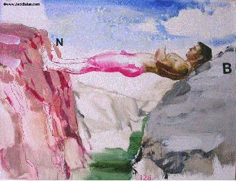
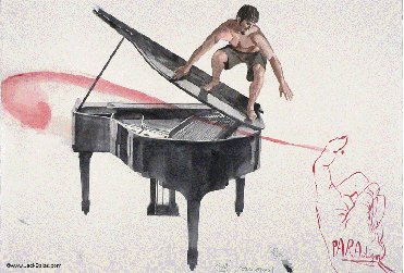
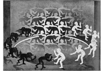
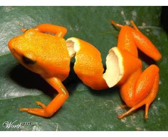
Juxtaposition, Substitution, Transformation & New Reality The classic essay format of “compare and contrast” is also an easily understood as a visual design principle. For example, take only two items and combine them in an interesting way. The veiwer will infer meaning by comparison. There are a couple basic approaches to working with a pair of objects. Juxtaposition is the art of surprising contrasts. Pairing may unite incompatibles or highlight significant differences. Unexpected, unforced but unmistakable similarities reveal the hidden links between unrelated, discordant or incongruous elements often giving a surprising new meaning. Substitution is a classic 2 in 1 technique. The designer introduces one element within an image to introduce a second idea. In the temporary fusion of two normally incompatible components the designer achieves the essence of wit, both recognition and surprise. Transformation is a gentle way of colliding two ideas to turn the first into the second. One is in the act of becoming the other. Your painting will involve pairing 2 or more objects in order to make an artistic statement of content and you will incorporated some kind of variation that creates a new reality by changing scale, pyhsical law, details, etc. You will use 2 new techniques. | ||
 | ||||
 | ||||
Above: Juxtaposition, Middle: Substitution Bottom: Transfromation | ||
 | ||||
 | ||||
 | ||||
 | ||||